
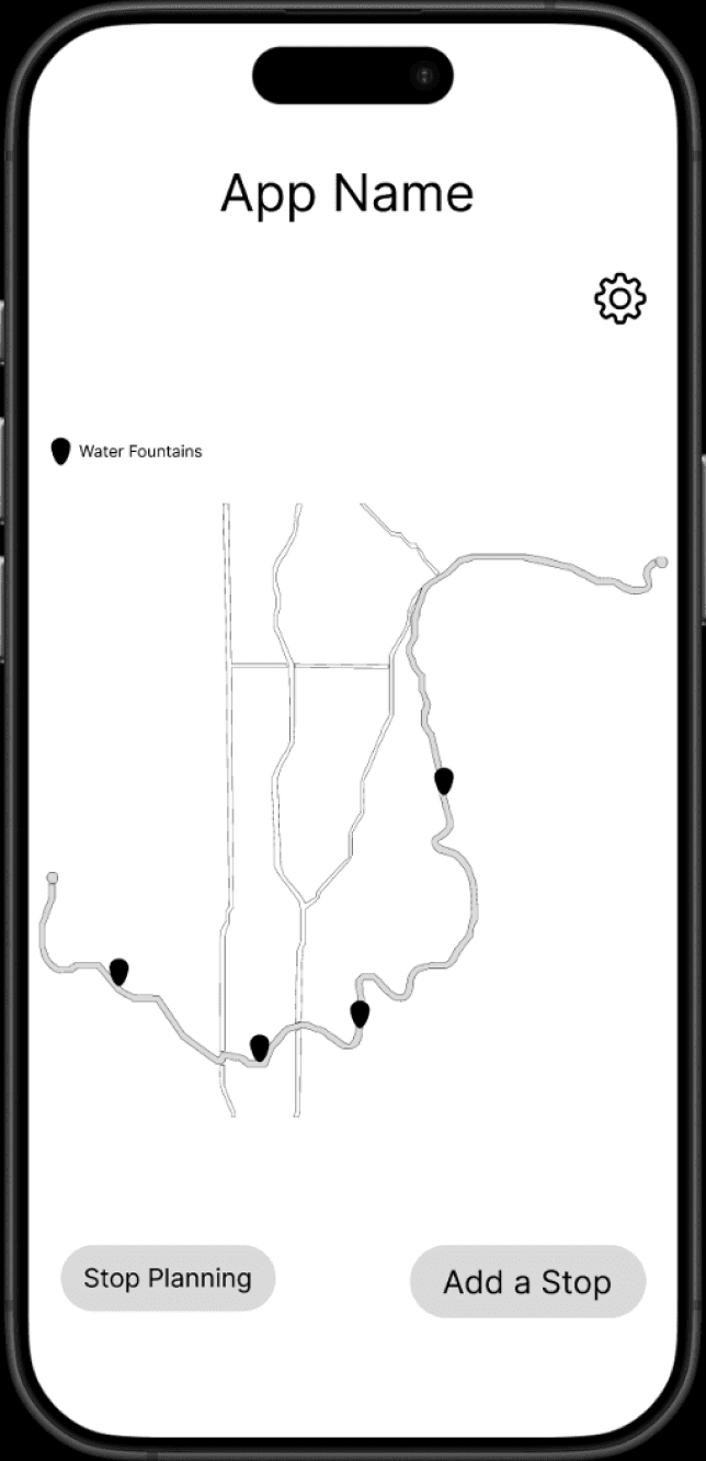
Low Fidelity
For our low-fidelity prototype, we created a digital prototype based on our established information architecture and user flows. This early version focused on core interactions to test usability and gather initial feedback.

Usability Testing
We then conducted usability testing with four participants who had never seen our product before. Our goal was to collect real user feedback to identify potential improvements. This testing provided valuable insights that informed key changes for our mid-fidelity prototype:
"When I turn on my location, I want to know how far the water fountain is from me."
"I want a photo of the water fountain when I click on it, or some information about it."
"Planning the route is very helpful since you cannot really plan on Google Maps, although I cannot zoom in, so it is a little hard to see the surrounding areas."
"A compass would be nice since it is a map."
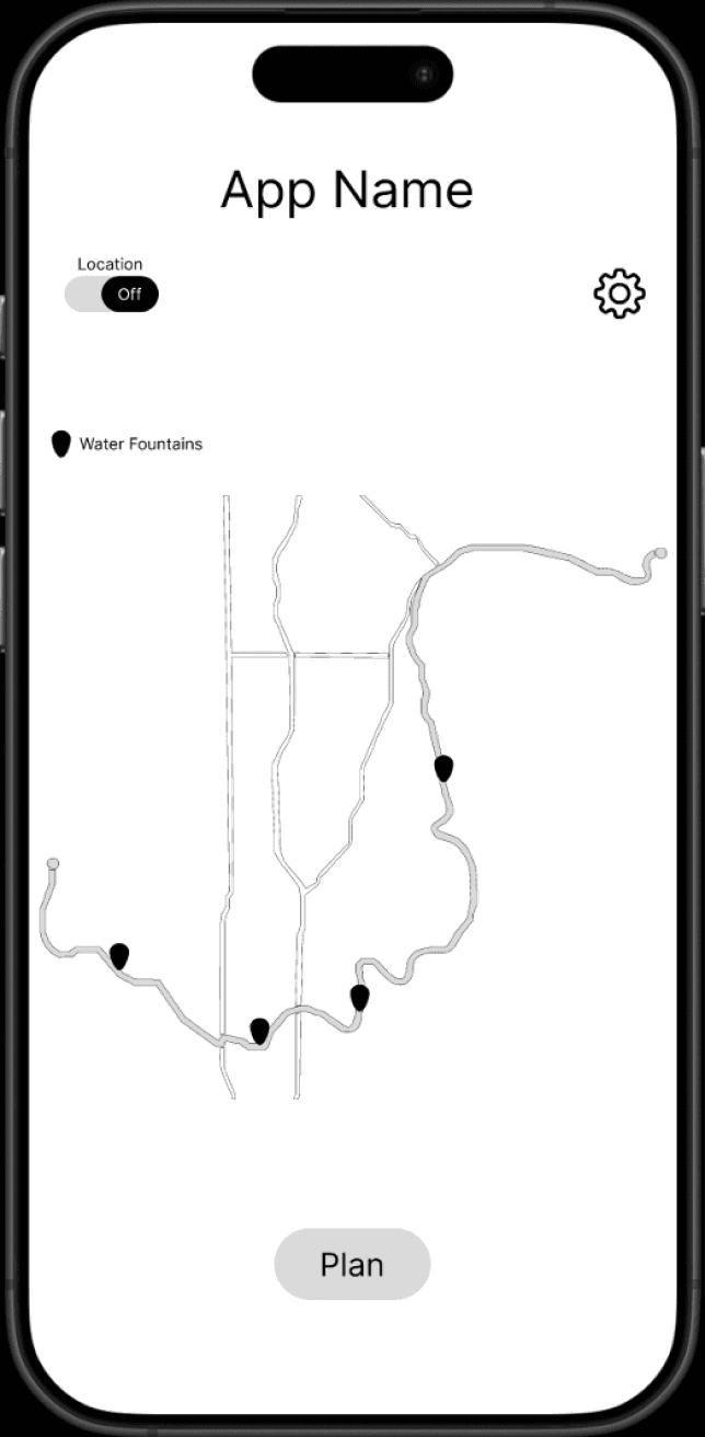
Mid Fidelity
Following the low-fidelity usability tests, our team refined the prototype for the mid-fidelity stage. This version introduced limited functionality and color while maintaining interactive elements. Iterating at this stage allowed us to further develop our design ideas before conducting another round of usability testing.
Changes from Low-Fi to Mid-Fi
From the user insights from our first round of usability testing we made the following changes:
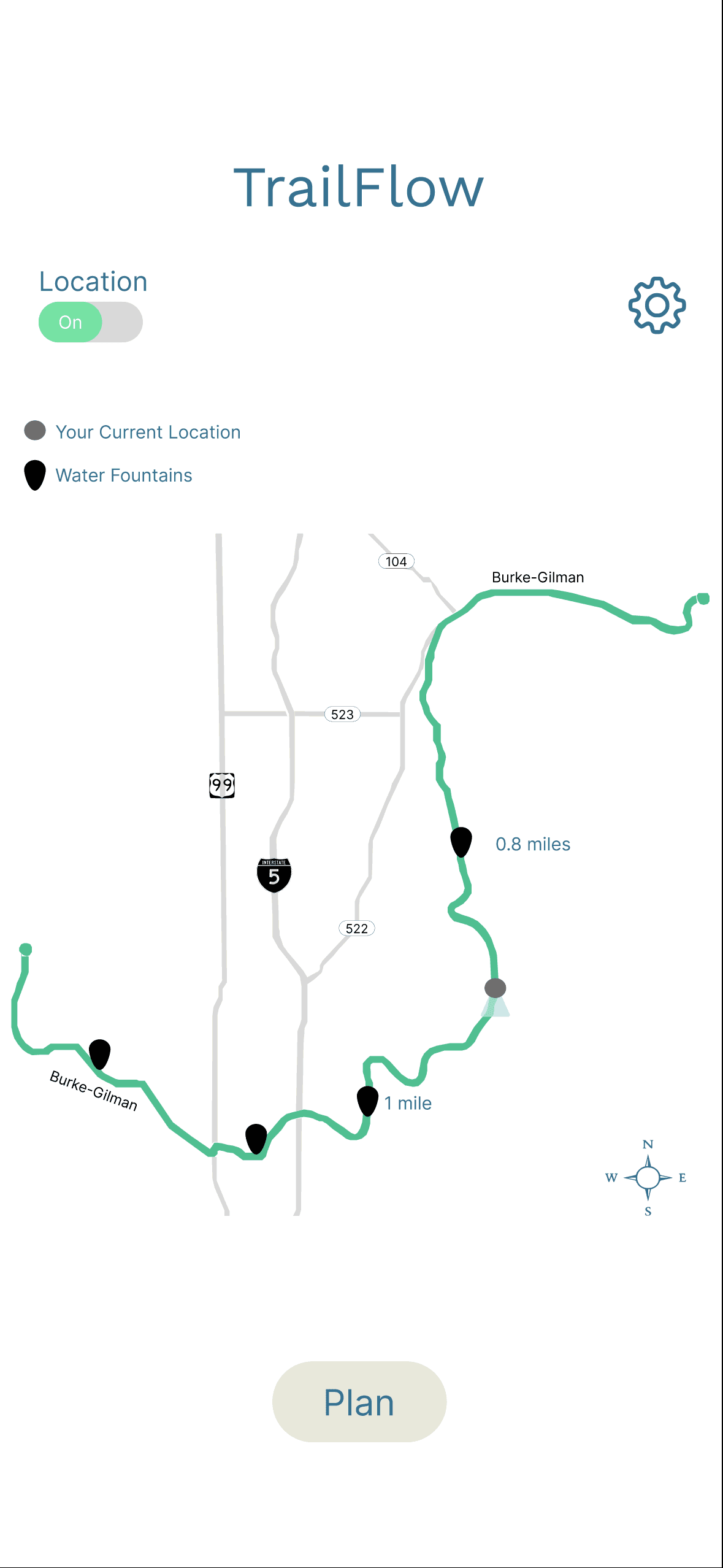
Showing the distance in Miles of the water fountain when the user turns on their location.
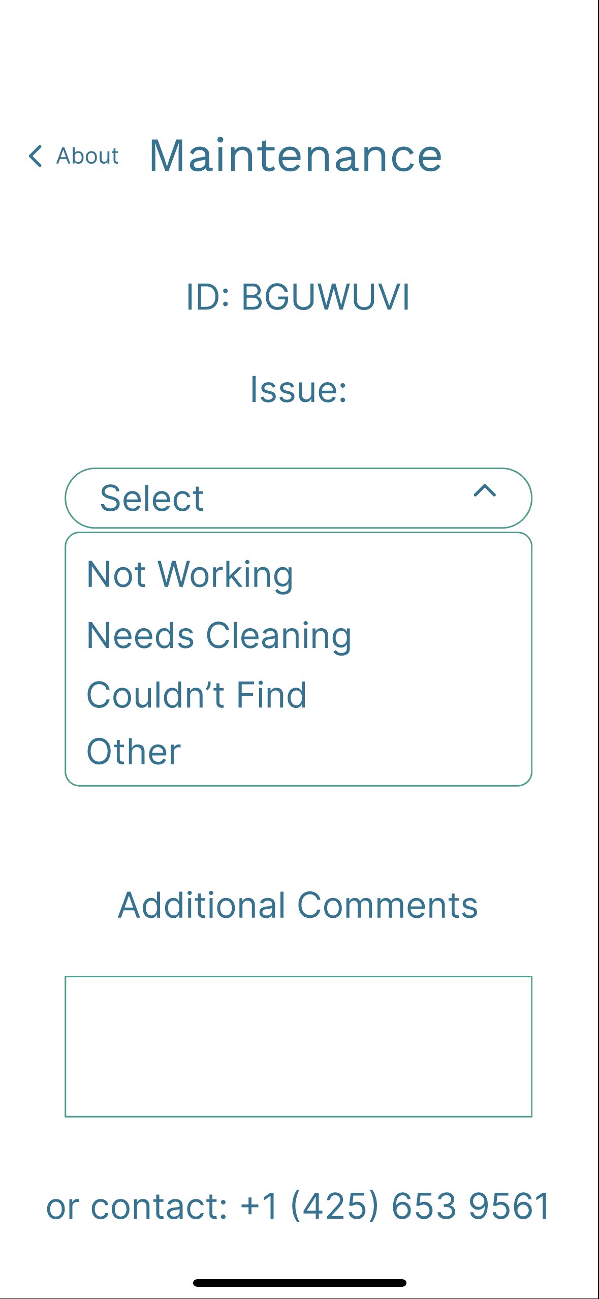
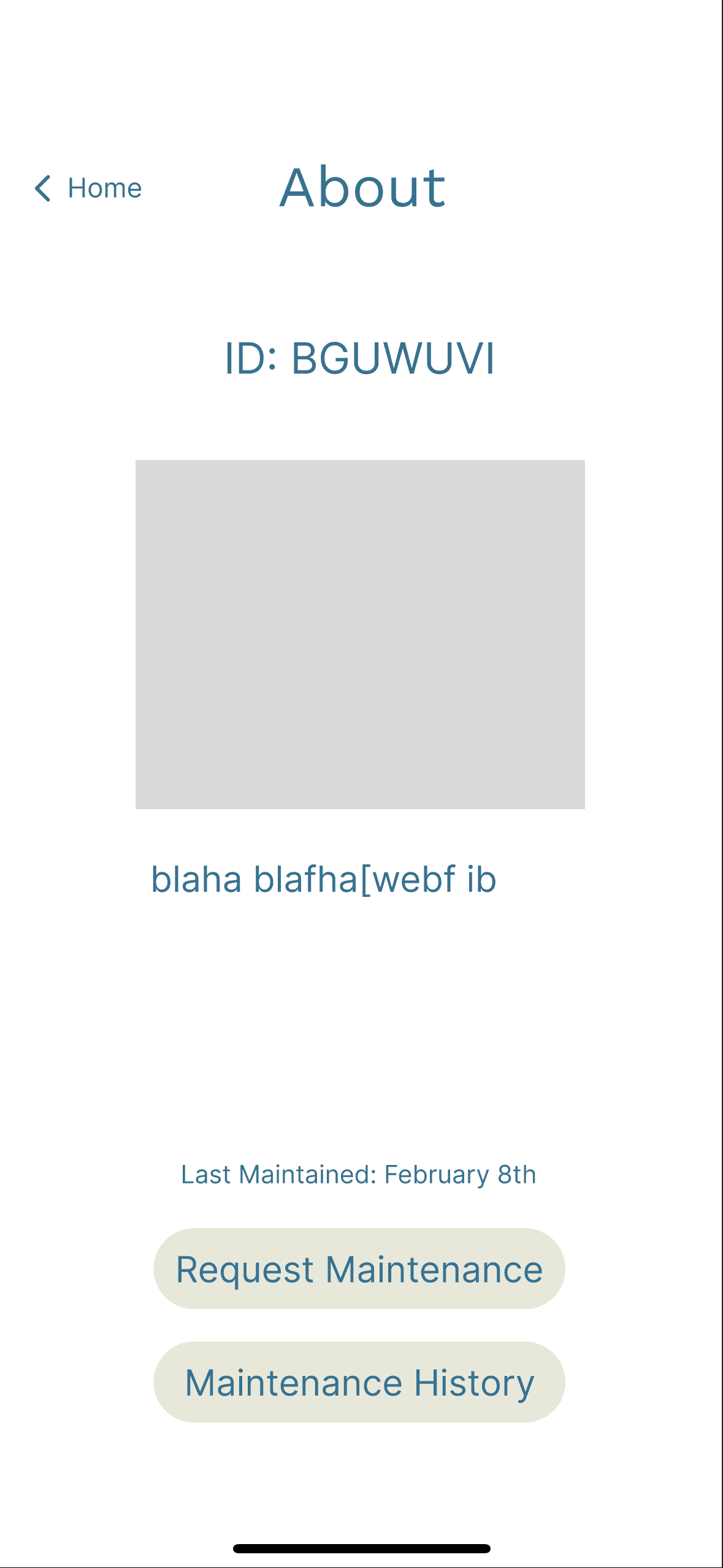
Having information about the water fountain when the user clicked on it.
Adding a compass.
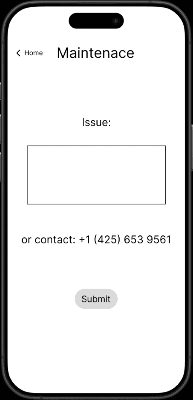
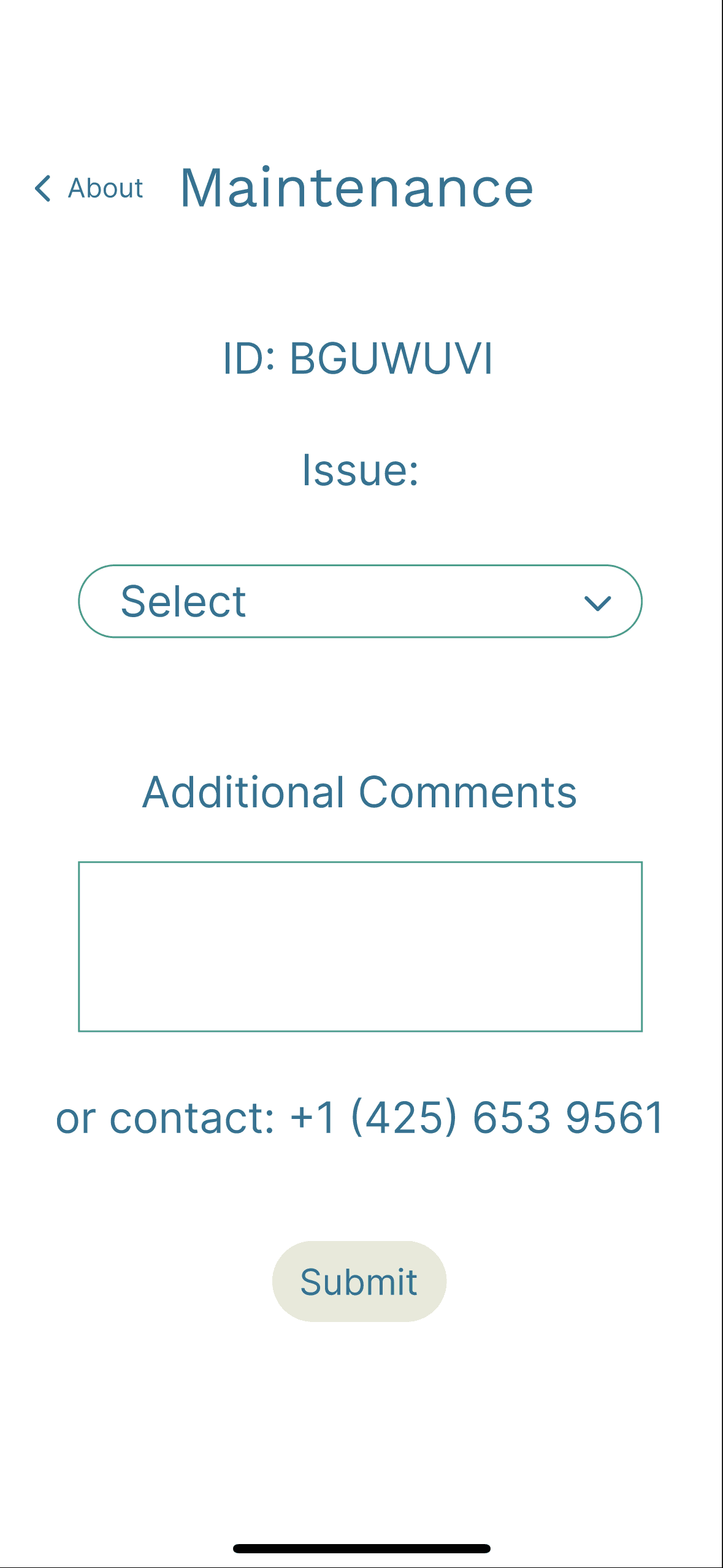
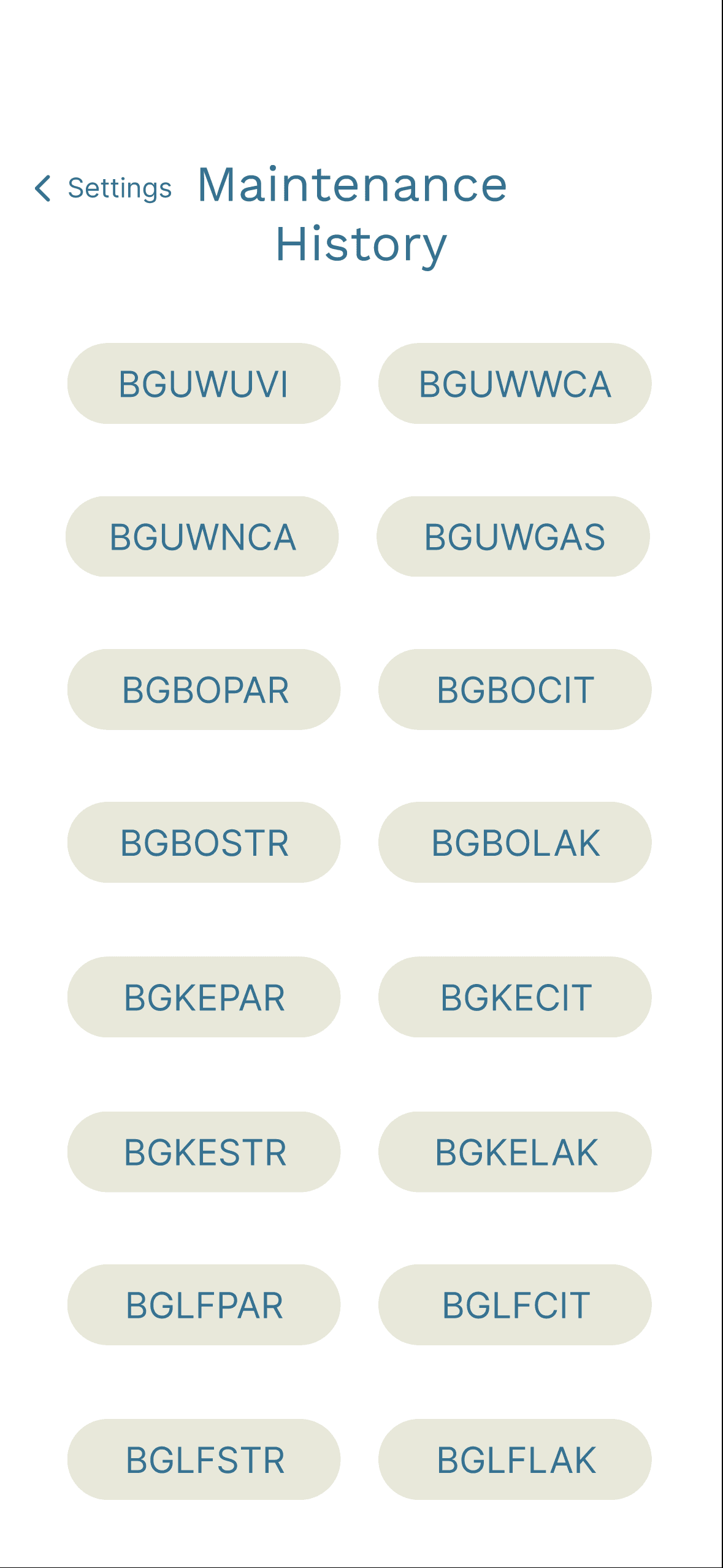
Having the maintenance page more interactive and easier to use when you are in a rush.
Usability Testing
Based on user insights from our first usability test, we implemented several key changes to enhance the user experience. We then shared our mid-fidelity prototype with four new participants to gain fresh perspectives. Their feedback was constructive and positive, offering additional areas for improvement.
"Finding the water fountain closest to my location was intuitive."
"Planning was a little confusing because it already had a route for me."
"I am unable to zoom in to plan the route or locate the nearest water fountain."
These insights played a crucial role in shaping our high-fidelity prototype and, ultimately, the final version of our product. This final iteration was prepared for presentation to our class and industry professionals, resuring our design was both user-centered and refined.
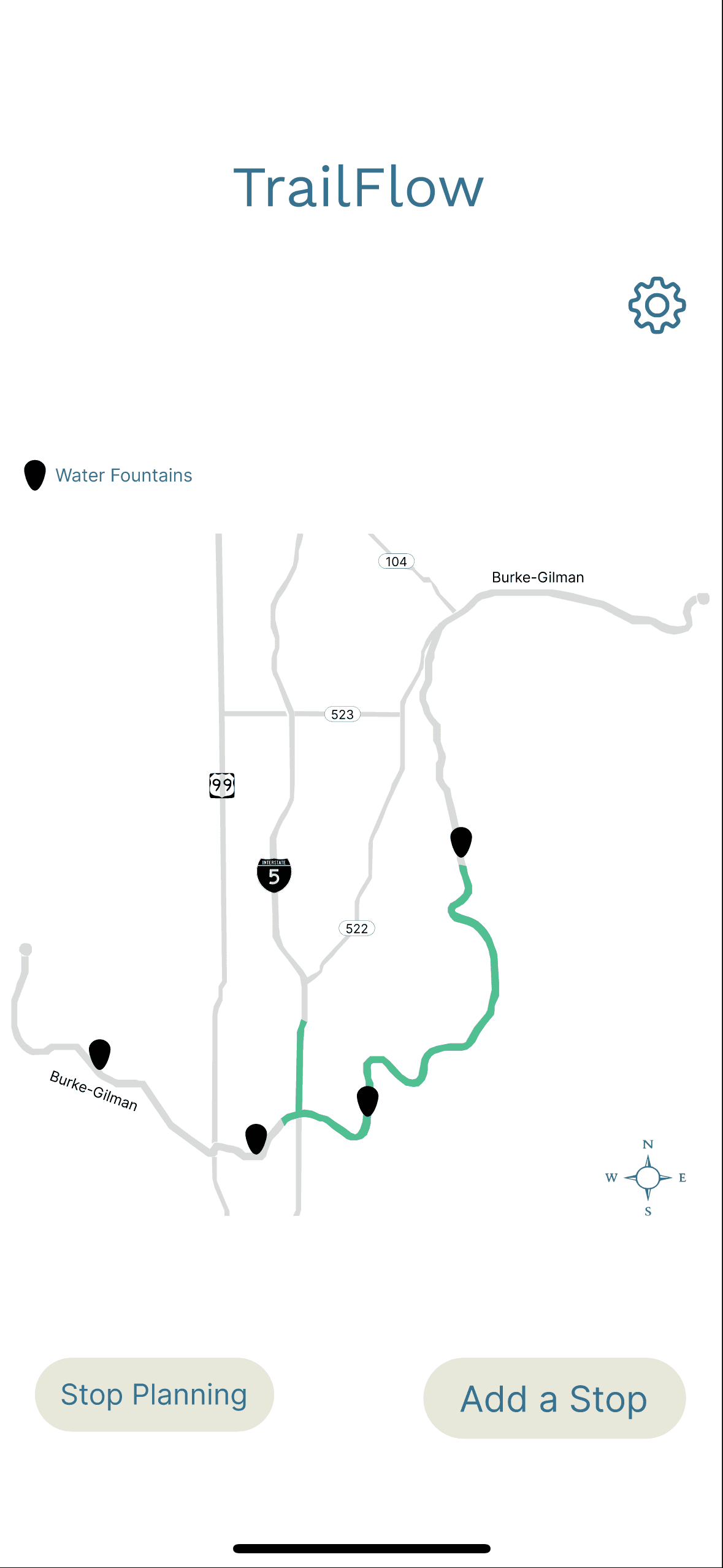
High Fidelity
After conducting usability testing on our mid-fidelity prototype, our team refined the design for the high-fidelity stage. This phase focused o enhancing interactions, improving aesthetics, and making the interface more visually appealing and polished.
From the user insights in the usability testing we made the following changes:
Added a zoom in/out feature.
Plan their route where users can click on two locations on the route.
Added more color.
More consistent icons/buttons.
These interaction sketches laid the foundation for our wireframes and user flows, which included key features such as route mapping, settings, and locations toggles. This phase was essential in establishing a concrete structure for our prototype, allowing us to iterate through low-, medium-, and high-fidelity designs.
Design Review
For our final design presentation, we showcased our completed prototype to peers and industry professionals. This presentation was an opportunity to demonstrate our design process, highlight key insights, and gather valuable feedback to further refine our work.
Feedback from Design Review:
Good on maintenance, users might also want to submit a phot of the fountain
Users might want to connect the app to a watch
It is a simple prototype
© TrailFlow